When dealing with a client that has Excel 2010, 2013 or 2016, the Sensdat team builds and formats the dashboard with Excel of course, using Pivot Tables, slicers, hyperlinks and conditional formatting. This blog post is about visuals only, what we call the “window” that we create and set on the very messy and dark “data-Mordor” . The “back-end stuff” (data modelling, Kpis, etc…) is of course made with our favorite tools: Power Pivot and Power Query but does not interest us here. The following process will help you save a lot of time and repetitive tasks while creating an awesome cockpit that will make all of your colleagues admire your skills!

In our last post, we looked at “how to prepare the tabs formatting” of our future very sexy cockpit. Now, it is time to add some content:
Pivot Tables and Charts
Create pivot tables
In order to add a pivot table that is based on your power pivot model, go to “power pivot” and open the “power pivot window” (on the very left of the ribbon). In this window you can “insert a pivot table” to which you are going to add your measures. Place the pivot table right under the title of the pivot (e.g. B6 for the pivot “Actuals ranking” in our example). Do this for all the pivot tables.
Format Pivot tables
This part is super important and needs to be done exactly the way it is described here in order to make sure that your formatting stays once you filter/unfilter (by using slicer, cf. part. 3 of the article). If you don’t follow these instructions, you will likely find yourself getting veeerryyy frustrated with your pivot tables losing some or all of the formatting you spent dozens of minutes to do! But because we like you, we will help you avoid this issue 🙂
First, let’s have a look at 2 tips that will save you a lot of time in order to work on pivot tables (conditional) formatting. We will just start by “throwing” those two tips to you and then we will apply them. So no panic if after reading them you don’t understand where we are heading to … just continue reading! 🙂
Tip 1 (nb: this is a web example, not ours but it is totally related to our problem)

Tip 2
Clear ALL filters before working on the formatting of your table. Basically, you should not have any filtered table because we have no slicers/filters yet but, still, make sure your table is not filtered in any way before doing anything more.

You before and after you read and applied our 2 tips for pivot tables formatting 😉
Ok, now let’s continue our dashboard and work on our own formatting:
Select your pivot table the following way: go to “net sales” on the pivot table until the little arrow appears and then click on your mouse.
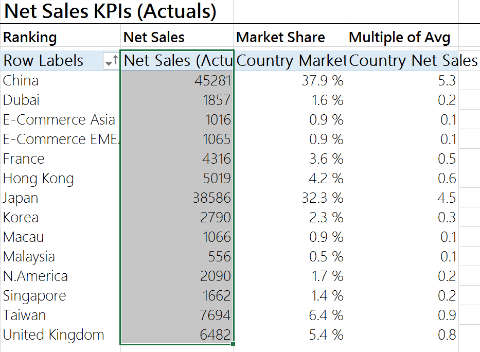
“Net sales” is grey (following the advice on “tip 1”). Then press “shift” and select the first item:
Then, keep “shift” pressed and click on the last item:

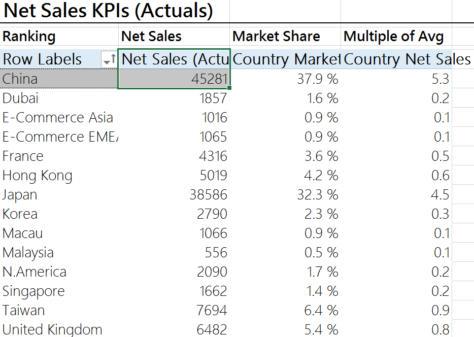
Your pivot table is now selected the right way to do some formatting that will not disappear later. Let’s do some formatting – remember to do it in this specific order!
Sort by (most of the time sort by “value”)
Now that your table is selected like on the above picture, click on the little arrow beside “Row labels” and chose “More Sort Options”. Then click on “Descending (Z to A) by” and chose by “Net sales (actual). This will rank your countries by net sales from the largest to the smallest.
Format Cells (Numbers)
Select your table and right click and select “format cells”, “numbers”, chose 1 decimal and tick the “use 1000 separator (,)” box. Click “Ok”. Trick: You can also directly go to power pivot and apply these steps to the measure “net sales (actuals)” this will directly format all the “net sales (actuals)” column and save you a LOT of time. It is also much more stable than applying formatting on a table.
Conditional Formatting
To apply conditional formatting, you need to select (again) your table “the right way” and click on “home”, “conditional formatting”, “data bars” and chose the color “blue” if you know that this table will never show any “negative” (e.g. sales) OR “green” if you know that this table may show you negative (e.g. Operating contribution, or Vs. Budget, Vs. Prior Year, …)
Filter by (often top n/bottom n)
To do so, click on the little arrow (where you clicked to do the “sorting”) and click on “Value Filters”, “Top 10”, and then chose “top” or “bottom” and the number (5, 10, 20…).
Nb: This step is not necessary all the time (e.g. here we did not need to do it as there are only a few countries).
Change pivot table name (to a meaningful one!) and uncheck “Autofit column widths on update”
To do so, right-click on the pivot table and click on “Pivot table Options” and:
- Change the name into a meaningful one (i.e. we don’t want “Pivottable 1” but rather see directly what the pivot table is showing: Ranking net sales actual)
- Uncheck the “Autofit column widths on update”. This will help you keep your pivot formatting every time there is a refresh of the sheet.
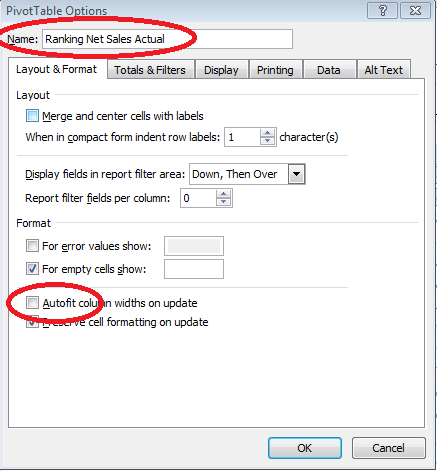
Nb: This “double-step” (VI) is MANDATORY FOR EVERY pivot table. If you miss it, the filters applied to the cockpit are going to mess up your tables (and it is not going to be “visually sexy”).
This is how your table should look like now:

Yeah, I know, it is getting sexier! 🙂
Now you “just” have to apply those steps to every pivot table…yeah pretty annoying I know but you need to be super careful/focused in order to do the job only once J Have fun…
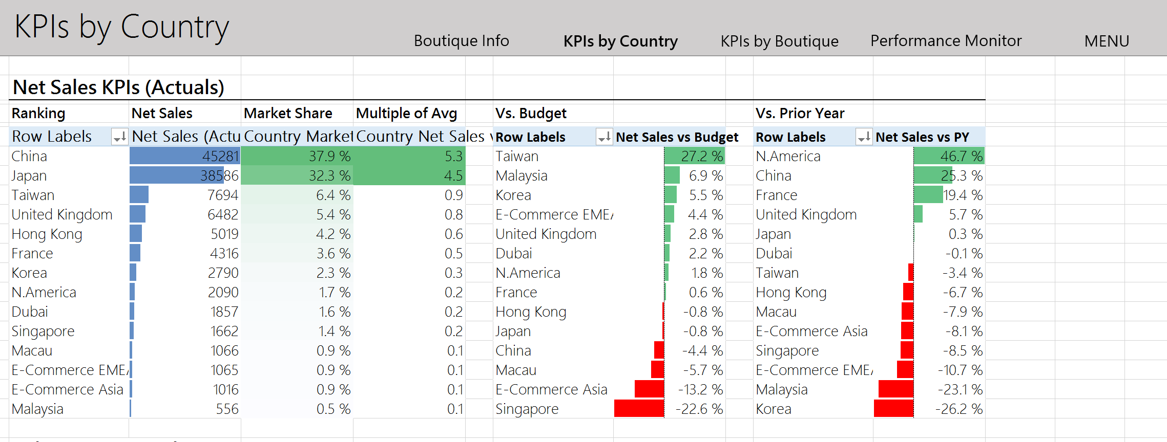
Once you applied the steps to every table on your tab, it should look like this:
 In the next post (part.3), we will add slicers – the “gadget” that will make the real difference to your audience! So stay with us 🙂
Kevin
Kevin Follonier is a swiss Co-Founder and CEO of Sensdat, a data analytics consutling company helping people make sense of their data.
Publications

We are now a Microsoft Gold Partner in Data & Analytics!
On behalf of the Sensdat team, I am proud to announce that we have reached the Microsoft Gold competency in...
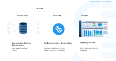
The Common Data Service for Analytics is the Next BI Revolution
The Common Data service for analytics, announced on March 21st, was the missing piece in Microsoft's new suite of BI...
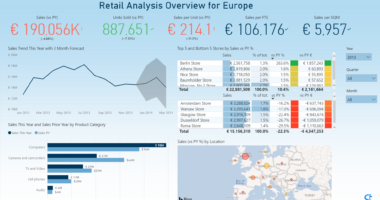
Helping retailers monitor their sales easily
With more and more data gathered accross different systems every day, it is increasingly more challenging for retailers to get...
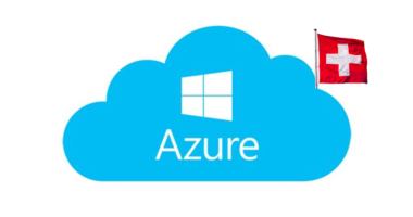
Microsoft Announces Cloud Data Centers in Switzerland
Big news for the Swiss finance and luxury industries! Starting in 2019, Microsoft will offer its hyperscale cloud services from...
Recent Comments