When dealing with a client that has Excel 2010, 2013 or 2016, the Sensdat team builds and formats the dashboard with Excel of course, using Pivot Tables, slicers, hyperlinks and conditional formatting. This blog post is about visuals only, what we call the “window” that we create and set on the very messy and dark “data-Mordor” . The “back-end stuff” (data modelling, Kpis, etc…) is of course made with our favorite tools: Power Pivot and Power Query but does not interest us here. The following process will help you save a lot of time and repetitive tasks while creating an awesome cockpit that will make all of your colleagues admire your skills!

In our last post, we looked at “adding the pivot table and charts the right way” to our already very sexy cockpit. Yeah! It was a long post. So, this one will be a short one, promised!
Slicers
Adding Slicers
Time has come to add what will make the key difference in this beautiful cockpit: the slicers!
Create Slicers
To do so, click anywhere on the first pivot table, then go to the “insert” ribbon and click on “slicer”. You should be able to select different categories (column names from different sheets in the powerpivot model). Select those you want (you can generate all your slicers at once!), click ok.
Place them on the right under the “Back to Menu” button, and for each slicer do the following:
- Right click on the slicer, “Size & Properties”, “Properties” and select “Don’t move or size with cells”. This is going to block your slicer at the place where you chose to put it.
- Right click on the slicer, “Slicer Settings” and beside “Caption:” rename the slicer as you want it to appear on the cockpit (a friendly name that has meaning to the user, i.e. this is business related).
Connect slicers (to each other and to the current tab’s pivot tables)
Right click on the slicer, “Pivot table Connections”, and tick all the pivot tables that are on the current tab. This will link the slicer to all pivot tables (and create some serious magic).
In this process, you can do a few checks:
- If you named your tabs in a logical way (this will help you knowing if you are creating the slicer connections on the right tab)
- If you named each of your pivot tables in a logical way (this will help you knowing if you are linking your slicer to the right tables)
Again, this has to be made for each slicer.
This is what your cockpit looks like now (after adding one slicer):

Final touch
The last step is to hide “Row 6” and remove “Formula Bar”, “Headings” and “Gridlines”.
- Right-Click on “Row b6” and click “Hide”.
- Go to “View” ribbon and uncheck “Formula Bar”, “Headings” and “Gridlines”.
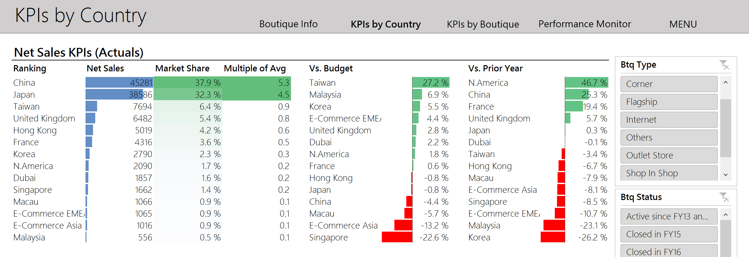
You are now done! Congrats! This is your final product:
 You are now fully equipped to make your boss’ and colleagues’ jaw drop!
Kevin
Kevin Follonier is Co-Founder and CEO of Sensdat, a data analytics consulting company helping people make sense of their data.
Publications

We are now a Microsoft Gold Partner in Data & Analytics!
On behalf of the Sensdat team, I am proud to announce that we have reached the Microsoft Gold competency in...
The Common Data Service for Analytics is the Next BI Revolution
The Common Data service for analytics, announced on March 21st, was the missing piece in Microsoft's new suite of BI...
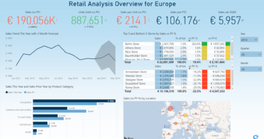
Helping retailers monitor their sales easily
With more and more data gathered accross different systems every day, it is increasingly more challenging for retailers to get...
Microsoft Announces Cloud Data Centers in Switzerland
Big news for the Swiss finance and luxury industries! Starting in 2019, Microsoft will offer its hyperscale cloud services from...
Recent Comments